
Showing posts with label Automotive. Show all posts
Showing posts with label Automotive. Show all posts
Monday, November 2, 2009


Sunday, October 18, 2009
Volkswagen:::Polo film festival

Car manufacturers are always looking for new ways to appeal to the female market and Volkswagen is no exception. To coincide with the launch of its new VW Polo, Volkswagen is holding a classic film screening specifically designed to lure women into its showrooms.
Polo’s Timeless Film Festival will see a classic chick-flick being brought back to the silver screen. The multi platform campaign incorporating radio, direct mail, POS, local press, email and, of course, cinema is Volkswagen’s most expensive to date, with total spend being put at £1 million mark.
Initially, women are being driven to a dedicated website where they are encouraged to vote on which of the ten classic films listed they would like to see brought back to the cinema. Users can register to receive two free tickets to see the most popular film from the list at one of the 180 cinemas participating nationwide. Regular updates will be given as the screening approaches and VW Polo cardboard cut-outs will be placed in each cinema. An ad featuring legendary movie voice-over man, Redd Pepper, will also play in cinemas nationwide.
The campaign will culminate with the VW Polo Timeless Film Festival at the end of October.
BRAND: Volkswagen
BRAND OWNER: Volkswagen
CATEGORY: Automotive
REGION: UK
DATE: Oct 2009
AGENCY: DDB
MEDIA CHANNEL


Tuesday, October 13, 2009
Volkswagen’s Viral Video Serie: The Fun Theory
In September, Volkswagen launched www.rolighetsteorin.se, an creative initiative to test if fun could change the behavior of people. The campaign has become a huge success in the last couple of days with a tremendous amount of views for the videos that Volkswagen subtly seed with this campaign.
Read on for the full statistics on the campaign and my personal view on this already strong marketing case in social media.
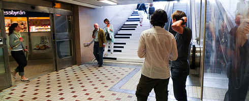
With this new campaign, developed by DDB Stockholm, Volkswagen turned a subway staircase in Stockholm, Sweden into a giant piano as part of their ‘Theory of Fun’ campaign. The effort is just one stunt that appears on the carmaker’s Rolighetsteorin.se website, which showcases efforts to get people to change by simply making things more fun. The Giant Piano clip got over 500,000 views on YouTube in just over two weeks.
The videos are aiming to change peoples lazy behavior by showing them the fun side of acting environmental responsible. As for the carmaker’s own contribution, “Volkswagen’s answer to the theory will be presented at a later stage on a separate website amongst other media,” says DDB Stockholm creative director Andreas Dahlqvist. “The site will display their whole range of environment technologies and cars—many, many fun ways to do something for the environment.”
Let’s take a look at the already launched videos:
Piano Staircase
The video received 1.200.000+ views in 4 days. Plus various copies with over 500.000 views. Minor detail: The original Swedish version - Pianotrappan - rolighetsteorin.se - “only” got 680.000+ views in 20 days.
The World’s Deepest Bin
This video received a bit less views, 88.000 views in 4 days. Minor detail: The original Swedish version - Världens djupaste soptunna - rolighetsteorin.se - “only” got 129.000+ views in 20 days.
Bottle Bank Arcade
About the platform
The platform bundles the videos and encourages people to submit their own ideas. The winner will be granted with a cash prize of 2500 euros. I sure do hope that Volkswagen promotes these actions and let people vote, share and encourage others with micro interactions. This way, the behavior change also comes from the people within.
Statistics on the videos
Lets take a look at the conversation market. What did the campaign do to the conversations? To check this out, we’ll have a look at Twitter.
Trendistic statistics on the word “piano”
It’s incredible, when you look at the statistics, you can see a minor trend on the word piano, just shortly after the launch of the videos. This means that people started to talk more about pianos then before the campaign. Next to all the regular conversations about pianos, a lot of the ones including a link direct to the advertisement page. Source: Twitter Search.
Trendistic statistics on the word “fun”
Another nice detail is that Volkswagen is being associated with fun a lot on Twitter. Looking at these results, you can see that Volkswagen is being mentioned several times per hour with the word fun and a link to the campaign.
Another nice detail is that Volkswagen is being associated with fun a lot on Twitter. Looking at these results, you can see that Volkswagen is being mentioned several times per hour with the word fun and a link to the campaign.
YouTube statistics on Piano Staircase
Unfortunately, the extended statistics have been disabled for both the Swedish YouTube videos, so we couldn’t find out whether these videos spread globally as well as the English ones. However, the English versions did show the extended statistics. Let’s check out the ones from the piano stairs video to see the popularity in a global perspective.
YouTube statistics on the video: viral growth
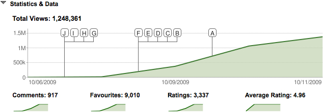
Even though the image above is from such a short period, its still incredible to see the large growth in such a short time. Also the amount of ratings, comments and favorites show people like the video.
YouTube statistics on the video: global reach
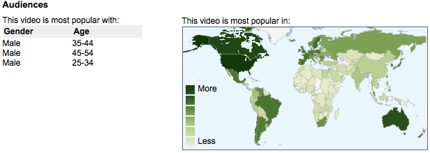
When you look at the global reach, you can see the video has worldwide popularity, which is an interesting fact. Humor and interests aren’t human aspects that have the same values on every person on this planet. It’s good to see the video has been liked in America, Australia and Russia.
Comparisation with Ray Ban
Earlier this year in April, I wrote about Ray-Bans success with their Never Hide campaign. The strong viral videos, starting with the videos of “Guy Catches Glasses With Face” from NeverHideFilms had a few strong elements that made it a viral success.
Looking at the aspects of the Volkswagen videos, it leaves no doubt that the Never Hide films gave some good inspiration to DDB Stockholm, the agency behind the films. The films are also not based on the core message of the brand, they could be a start of consistent line of communication, are highly entertaining, aren’t just about the product and could have been done by average Joe.
Could it be that Volkswagen is following Ray-Ban’s successful footsteps by creating successful, fun and creative videos to feed the entertainment market? I certainly love this campaign of Volkswagen and hope they’ll receive the viral success they deserve!
Make sure to also check out the article on Creativity-online.com, which includes an interview with the creative director from DDB Stockholm and take a look at the fun behind the scene photos on Flickr.
Sources: ViralBlog.com, Creativity-online.com.
Monday, September 21, 2009
Aviva car insurance:::

Aviva wanted to engage consumers when they would be in the right frame of mind to think about car insurance. The obvious solution was to target motorists when they were actually on the road, so the insurer decided to advertise with In Your Space.
In Your Space displays advertising on the sides and back of its trucks. According to the media owner, 64% of motor vehicle traffic is via motorways and major A-roads, which are covered by its moving billboards. It recently carried out a £70,000, 12-month long research programme to provide the likes of Aviva with specific targets.
Aviva’s campaign is running on a total of 210 ad sites - termed as ‘high reach billboards’. The lorries carrying the ads will cover more than one million miles of road. If estimates prove correct, the campaign will communicate to over 24 million motorists every month, with each motorist expected to see the adverts at least 7 times, delivering a total of 508 million impacts over the three-month campaign period.
With TV advertising overloaded with insurance companies, it makes sense for a car insurance firm such as Aviva to move its advertising into a more relevant space for its target market, although the environmental impact of such advertising may concern insurance customers in the future.
BRAND: Aviva car insurance
BRAND OWNER: Aviva
CATEGORY: Automotive
REGION: UK
DATE: Aug 2009 - Oct 2009
AGENCY: AMV/OMD
OTHER AGENCIES:Posterscope
MEDIA OWNER: In your space
MEDIA CHANNEL

Sunday, September 13, 2009
APG Creative Strategy Awards - The New Volkswagen Website
A Continuous Focus on the Ideal Visitor Experience
Summary
In this paper we show how account planning kept a continuous focus on visitors’ needs, helping Volkswagen.co.uk reach its highest share of visitors for automotive manufacturers’ websites. By 2007, the Volkswagen.co.uk website was six years old and needed a redesign. Besides, customer behaviour online had changed. Visitors had become more demanding of their online experiences as more of them got online; the web had become more sophisticated and so had visitors’ skills. In the automotive category, more people than ever were researching what car to buy online and manufacturers’ websites, to a degree, had taken on the role of dealerships. We identified insights for each of the key stages most people would pass when buying and owning a car. Our website had to help people progress to a further stage by addressing unmet needs. Through a continuous focus on the visitor experience and a planning effort to remain involved throughout the eighteen months of the project, we ensured that the website delivered at the end was aligned with our initial vision. Every part of the site is built around the ideal experience that online car buyers would expect from Volkswagen and makes every stage of buying a car more intuitive.
Introduction
In this paper we will show how account planning kept a continuous focus on visitors’ needs over eighteen months of website development, helping Volkswagen.co.uk reach its highest share of visitors for automotive manufacturers’ websites (from 9.2% in 2007 to 10.4% in 2008).
Making the case for a new website
By 2007, the Volkswagen.co.uk website was six years old and ancient by web standards. It was time for a redesign. While the current design had been efficient at delivering information to visitors, it didn’t provide a brand experience and didn’t help move people towards purchase as much as it could.
The first thing we had to do was to make a case for why Volkswagen should go to the expense of creating a new website from scratch rather than keeping the one they had.
The business case was largely already made: we had just finished writing an IPA award paper in 2006 showing how a more engaging experience for Volkswagen’s Golf GTI resulted in more profitable configurations for Volkswagen; we forecasted a similar improvement in profitability for other models if we were to build a new, more engaging website.
More compelling, however, was the evidence that buyer behaviour had changed in the six years since the last design. The arrival of the web had transformed the car buying environment. More people than ever were researching what car to buy online.

In fact, by 2007, the Internet was the first source used to research cars. 57% of all buyers tried online research before using other media. 80% of consumers used the Internet as an information source during the vehicle buying process. Prospects spent more time online with the brand than in any other medium; of an average nineteen hours researching their next car purchase, eleven of them were spent online.
As a result, visitors knew what they wanted, how they wanted it, and what they were prepared to pay for it. Manufacturers’ websites, to a degree, had taken on the role of dealerships. Rather than visiting a selection of dealerships, people visited a selection of websites; according to a study published by Network Q, the average customer visited less than three showrooms before buying in 2007 (compared to six in 2001).
How the competition reacted
Despite an opportunity to address these issues, most manufacturers’ websites simply continued to use their websites as a confusing hard sell environment. A typical competitor’s website bombarded visitors with hundreds of choices, thousands of pages and cluttered imagery, with small cars fighting large cars and luxury cars for page space, with navigable items and links inserted for fear of what might happen if customers weren’t told to do one thing or another.

Understanding people and modelling their behaviour
Similar to the process that Volkswagen takes when building its cars, building the new Volkswagen.co.uk site started with a thorough understanding of people. By modelling the behaviour of different customers, we were able to build a website that makes every stage of buying a Volkswagen more intuitive.
Even though people had changed their research methods, the stages of the buying process itself remained similar. We visited dealerships and interviewed people. We also drew on New Car Buyer Survey results and 39 years of agency experience of speaking with car buyers.
This allowed us to identify thirteen key stages of purchase and ownership. These were not a linear journey that all people took, but were rather important stages most people would pass when buying and owning a car.

The brand experience had to help people progress to a further stage, particularly through bridging the gap between consideration and purchase. Having customer insights for each of the key stages helped us to come up with features that would address unmet user needs.
We also looked at the shopping experience on other websites outside of the automotive category. Visitors had become more demanding of their online experiences as more of them got online; the web had become more sophisticated and so had visitors’ skills. Though mainly driven by other industries, innovation was on the rise.
Our strategy, therefore, considered three major behavioural frameworks: the shift in the car buying process towards online research; the 13 stages of car purchase and ownership; and increasingly sophisticated user expectations.
Planning the ideal experience
Based on our research and insights, we created a video briefing to inspire our team by outlining how we could take an approach different to that of our competitors. This was our challenge to the team:
Our idea was to put the customer, not the brand, at the centre.
This was translated into an overall conceptual model for how we wanted people to experience the site.

Keeping the focus on the visitor
The true value of account planning was shown in the eighteen months between the development of the vision and delivery of the website. Planners sat amongst user experience architects, creative teams and developers throughout.
Making the video briefing and creating the conceptual model had been vital steps towards designing the right experience on the website. We knew, however, that the project would take at least a year to complete, so we translated the vision and conceptual model into a set of user experience principles, which allowed us to remain involved throughout the project. In this way we would ensure that the website delivered at the end was aligned with our initial vision.
These were the five user experience principles we set for the broader team:
- The site will be a destination for anyone interested in buying a car and become the most visited automotive website in the UK with its new features and functions as the main attractions.
- The car models are the heroes of the Volkswagen brand, each with its own features, benefits and personalities. Each will be given a separate pedestal to stand on, even though the site is not about creating model-based campaigns.
- The site will become the hub of Volkswagen; bringing together the brand, their retailers and customers, and strengthening the relationship between the three parties.
- The site will reflect the brand essence by demonstrating Volkswagen’s better thinking in all business areas and through all page details.
- The site will recognise the distinct needs of different audience groups. We will not try to be all things to all people.

Every corner of the website experience was subject to planning scrutiny; each stage of the visitor’s journey was issued a flexible brief. The cascading nature of the different experiences created dependencies between each brief that required day-to-day attention.
An added benefit to having the living wall of briefs came during measurement phase. When it was time to work with the website measurement technology provider, we knew exactly how we wanted each part of the site to be measured because we knew how visitors would ideally behave.
The creative result
After eighteen months, the result is a site that looks and behaves in a markedly different way. Right from the homepage you can see that the experience is designed around visitors’ needs. We don’t bombard our visitors with hundreds of choices; instead we highlight the five most important ones.

Another example of our visitor focus is the model search and selection function. Where our competitors ask you to select models for inspection simply by model name and shape, the Volkswagen site allows people to find a car suitable for their needs using a series of easy-to-understand filters based on key criteria such as shape, size, price, engine type, performance, or fuel efficiency. As you change your criteria the relevant models appear or disappear, leaving you with only the Volkswagens that are right for you.

Once you’ve selected a model, the website presents you with a bit of the ownership dream. During our research we found that people need to imagine what it might be like to own a GTI, or in this case, a Touareg 4x4. Within the thirteen stage buying process, this is our opportunity to build additional consideration and desire for a model.


The true heart of the website experience, however, is the configurator. The configurator smoothes out the complexity of buying a Volkswagen and presents the customer with a personalised, enjoyable experience. A fully animated interview process allows you to watch your dream Volkswagen being built, from getting the chosen paint colour sprayed on to finding the right finance package.

Finally, we knew that if the website was really replacing showroom visits, the following stage would be buying a Volkswagen. It was therefore important for us to allow visitors to find a retailer, choose one based on location or other customers’ recommendations and book a test drive, all directly on the website.

In the end, the creative result was a predictable outcome of our process. Every part of the site (of which we’ve only shown a portion) is built around the ideal experience that online car buyers would expect from Volkswagen. On launch Volkswagen.co.uk looked and behaved like no other manufacturer’s website. The constant focus on visitor experience has paid off.
The results, so far (2007 vs. 2008)
Despite car sales being down by 11% year over year in the UK, we have seen noticeable improvements since launch. With visitors up by four percentage points, Volkswagen.co.uk became for the first time the most visited automotive manufacturer’s website in the UK in November 2008, beating industry sales leaders Ford and Vauxhall.
The people who used the site are now more likely to buy: the ratio of online test drive requests to retail sales went up by 8%.
According to Psyma, a cross manufacturer website survey, between October 2007 and October 2008 overall satisfaction was up by six percentage points (from 70% to 76%). The number of people agreeing with the statement “The website makes me feel positive towards the VW brand” increased by five percentage points (from 68% to 73%) and the number of people agreeing with the statement “The site has exactly the information and function that I require” was up by seven percentage points (from 54% to 61%).
The initial results are encouraging despite the current economic climate. But what excites us most is that we have established a visitor-focused planning process that will continue building on this early success.
Friday, September 11, 2009
Mercedes-Benz
According to its brand identity, Mercedes-Benz’ stands for business people with success and leadership. The problem is that this demographic, usually hardworking with little free time, are often difficult to reach by traditional means.
The perception that these executives never use digital media, however, Mercedes-Benz found to be incorrect. Its research showed that business leaders are voracious consumers of digital media. 30% read blogs on a regular basis and 72% said they were tech-connected by necessity, knowing that keeping up with the latest technology is vital to the success of their businesses.
Partnering with social networking site, A Small World – which offers membership on an invitation only basis – the car manufacturer provided users with exclusive information, content and competitions, at the same time being careful not to interrupt the user’s online experience or bombard them with too many advertisements. Offers were mainly related to activities already sponsored by Mercedes-Benz; its Fashion Week, for example, or opportunities to join its Formula One race team for a day out.
67% of those surveyed after the campaign said the advertising had impacted on their perception of the Mercedes-Benz brand positively. Nearly 40% of respondents said the campaign had made them want to find out more information about Mercedes-Benz in general. In addition, 30% said that the advertising would cause them to recommend the brand to someone else.

BRAND: Mercedes-Benz
BRAND OWNER :Daimler AG
CATEGORY :Automotive
REGION: Global
DATE: 2008
AGENCY: Davinci Selectwork
MEDIA OWNER: A small world
MEDIA CHANNEL
Mazda:::Mazda opens its layer
It is imperative for car companies to be associated with cutting-edge technology, but at the same time avoid anything potentially seen as superfluous. So, Mazda’s announcement that it was using augmented reality in its latest campaign came as something of a surprise.
Augmented reality has, until now, been rather gimmicky – 3D lapdancing girls appearing out of 2-D paper, and the like. However, JWT’s new augmented reality application – Layer – is something different, something potentially very useful. By integrating Google maps into its service it allows users to see what is happeningaround them by displaying real-time digital information on top of reality.
Mazda has built the first ‘layer’ on the new network. Through a combination of QR codes and barcode technology consumers can scan special Mazda ads in the traditional press with a smartphone and find all available Mazda dealers within the vicinity. The tagline on the video demonstrating the new service is: ‘From magazine to Mazda in 80 seconds’.
And where Mazda lead, it looks like others will follow. 10,000 applications were downloaded in the first two days and JWT says it has clients wanting to build ‘layers’ in Amsterdam and Russia.


BRAND: Mazda
BRAND OWNER: Mazda
CATEGORY; Automotive
REGION: UK
DATE: Aug 2009
AGENCY: JWT


Wednesday, August 26, 2009
Audi modernizes four-ring logo + Typographic Relaunch
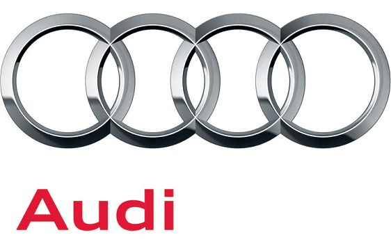
Audi, which has been associated with the four interlocking rings since the formation of the original Auto Union in 1932, and synonymous with the logo since the revival of the brand in 1965, has given its long-running logo a minor update for the 21st century.
While the rings already look fairly modern with their three-dimensional texture and shadowing, Audi decided to shine them up a bit. The result is a finish that looks like polished chrome and is nearly as authentic as seeing the real thing emblazoned across the hood of a 'Bahn-stormer.'

While the rings already look fairly modern with their three-dimensional texture and shadowing, Audi decided to shine them up a bit. The result is a finish that looks like polished chrome and is nearly as authentic as seeing the real thing emblazoned across the hood of a 'Bahn-stormer.'
Further embracing a more modern, simple style is the Audi name itself, which has moved down away from the rings and to the left of center. More importantly, it has shrunk and has abandoned its exaggerated, unconventional font (seen in the old logo pictured to the left) in favor of a plainer sans-serif font.
The end result is a very chic, modern take on an ageless design. Expect to see it quietly make its way onto Audi's website, signage, documents, and more worldwide as the brand continues to refresh itself during its centennial celebration
The end result is a very chic, modern take on an ageless design. Expect to see it quietly make its way onto Audi's website, signage, documents, and more worldwide as the brand continues to refresh itself during its centennial celebration
Audi’s Typographic Stylings

Audi Type replaces Audi Sans, a modified version of Univers Extended a Roman and Extended type family commissioned by MetaDesign from Paul van der Laan and Pieter van Rosmalen. Along with being part of the new logo,

Corporate typeface comparison, Audi Sans (above) and Audi Type. Image source.
The new type family can be seen in full action in the 2008 Annual Report, available as a PDF. The result is a strikingly modern and contemporary look that blends quite well with the Audi cars, slick and sophisticated. For a few more images and background, please visit FontFeed.
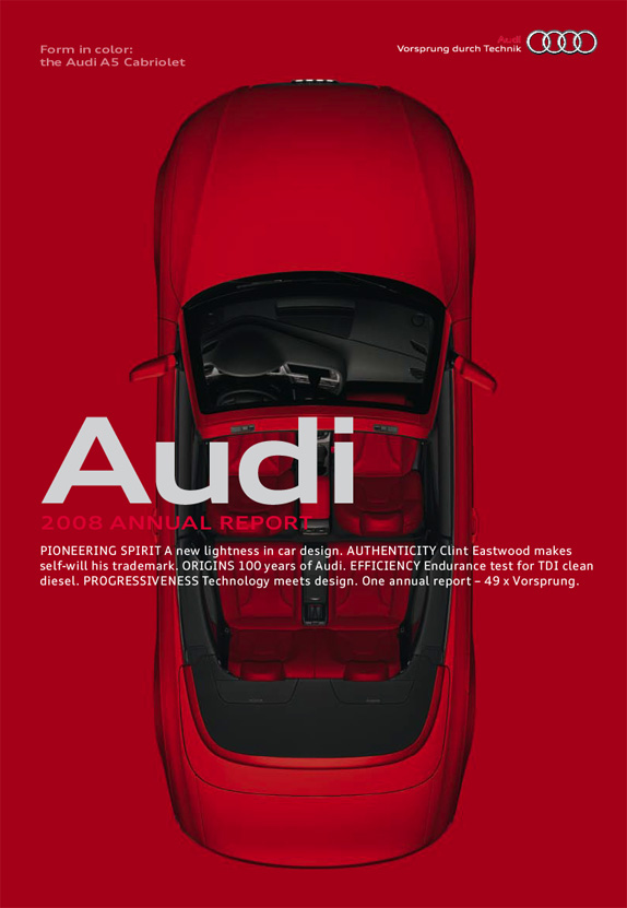
2008 Annual Report cover in red. Two other versions, green and gray, are also available.
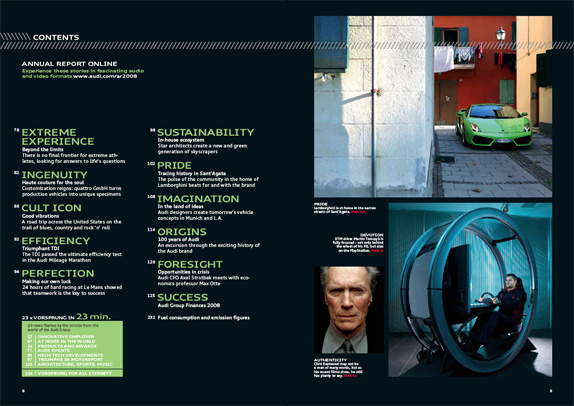
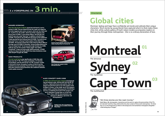
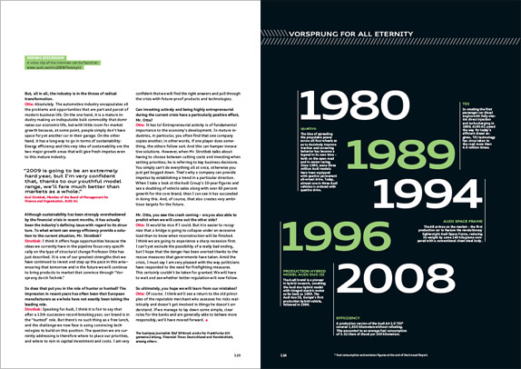
2008 Annual Report sample spreads.

The new 2010 Audi A4 Allroad at the Geneva Motor Show 2009, with the new typog raphy.
If you look closely at some recent print ads from Audi you may discover a subtle typographic restyling. The automotive constructor stopped using the modifiedUnivers Extended called Audi Sans intro duced 12 years ago by MetaDesign, and switched to AudiType. MetaDesign – which is respon sible for this facelift as well – commis sioned Paul van der Laan (Type Invaders) and Pieter van Rosmalen (Caketype) to design the new corporate face for Audi. Both Paul and Pieter studied type design at the KABK (Royal Academy of Arts) in The Hague, The Nether lands.
The previous corporate typeface Audi Sans (a modified Univers Extended, top) and the new Audi Type by Paul van der Laan & Pieter van Rosmalen (bottom)
Print ad for Audi Quattro, Switzerland
Neither Audi nor their CI agency have released an official statement about the typographic relaunch yet. Without knowing their exact motivation I think I perceive the politics of baby steps. The foundation, or may we call it the “chassis”, is preserved – character width, grey value, metrics – while the bodywork was refined. And this is very elegant, away from the static towards the dynamic, the high-quality.
: : E D I T : :
Some extra clari fi cation about the new typeface. We have been told that Audi Type was built completely from the ground up. Although its character has indeed been preserved up to a certain point, the character widths and spacing in the new typeface are actually quite different. Normal and Bold are somewhat of a darker colour, and ascenders and descenders are longer than in Univers to guarantee optimal legibility in the smaller point sizes.


One of three covers of the 2008 Annual Report
Detail of the table of contents, from the 2008 Annual Report. Audi Type currently exists in Normal, Bold, Extended Normal, and Extended Bold. Italics are under devel opment, and Greek and Cyrillic will be produced subsequently.
At Typo 2007 MetaDesign’s Carl-Frank Westermann explained in great detail the strategy behind the Audi Sound Branding, specif i cally the acoustic endings of the commer cials. By applying minute inter fer ences in the overtones the MetaDesigners lent a higher quality to the two seconds. This scenario seems to work perfectly well for typog raphy as well.
Paul van der Laan and Pieter van Rosmalen will launch their new venture Bold Monday in the near future. At Robothon Pieter handed me a set of very nice postcards with sneak previews of the typefaces. More details to follow, and sooner than you might expect.
Subscribe to:
Posts (Atom)